 These are random photos and videos that are collated for prosperity sake. Enjoy!!!!!!!!!.........
 Monday, August 17, 2015
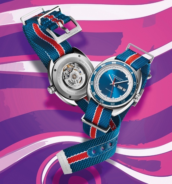
When we think back to the watches of the 1970s, we think of bold colors, rich contrasts and unusual shapes. Bright blue and red played big roles in the decade’s color schemes. Contrasting colors for indexes and subdials ensured good legibility. And many cases were oval.http://www.watchtime.com/reviews/those-crazy-70s-a-test-of-the-hamilton-pan-europ-day-date/
These are random photos and videos that are collated for prosperity sake. Enjoy!!!!!!!!!.........
Subscribe to:
Post Comments (Atom)
No comments:
Post a Comment